Website
Personal
2023
Background
This project aimed to create a fun and interactive sign-in page that really highlighted user interaction. I wanted to break away from the usual boring forms, so I designed something that feels lively and welcoming. I used playful animations and bright colors to make the experience engaging right from the start.
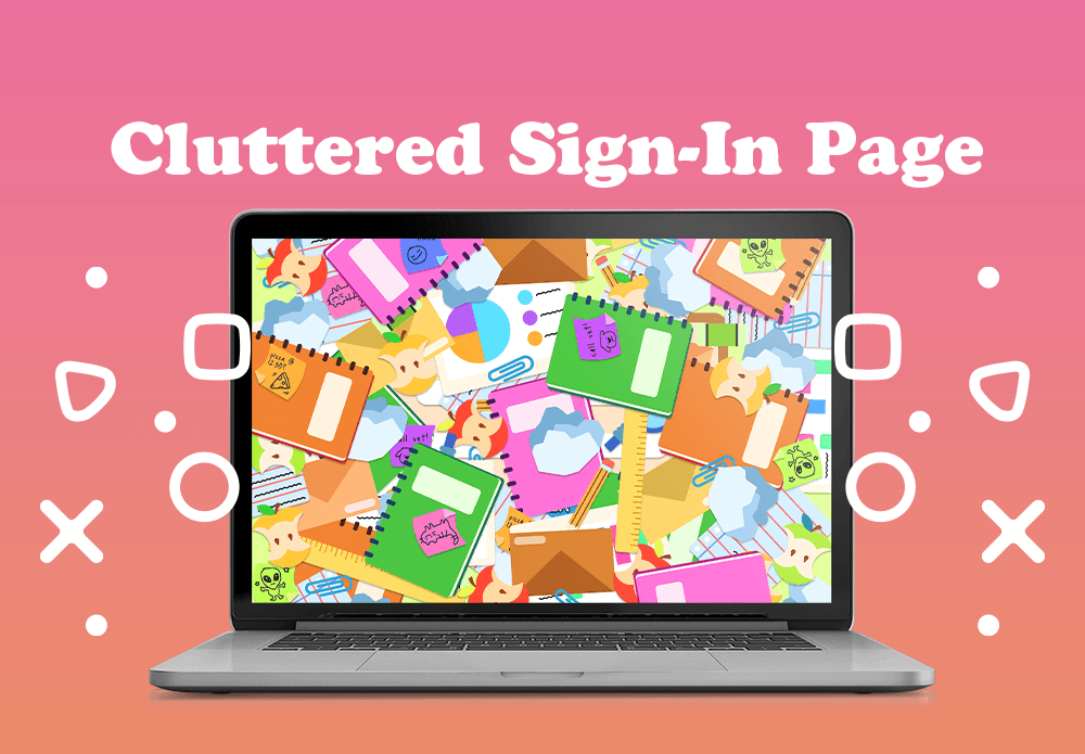
The theme of the sign-in page was 'Let’s Get Organized!' so I aimed to keep that vibe alive by creating a fun experience centered around tidying up a cluttered desk. I wanted users to feel like they were actively participating in the organization process, making the sign-in feel more interactive and engaging.
From Clutter to Concept
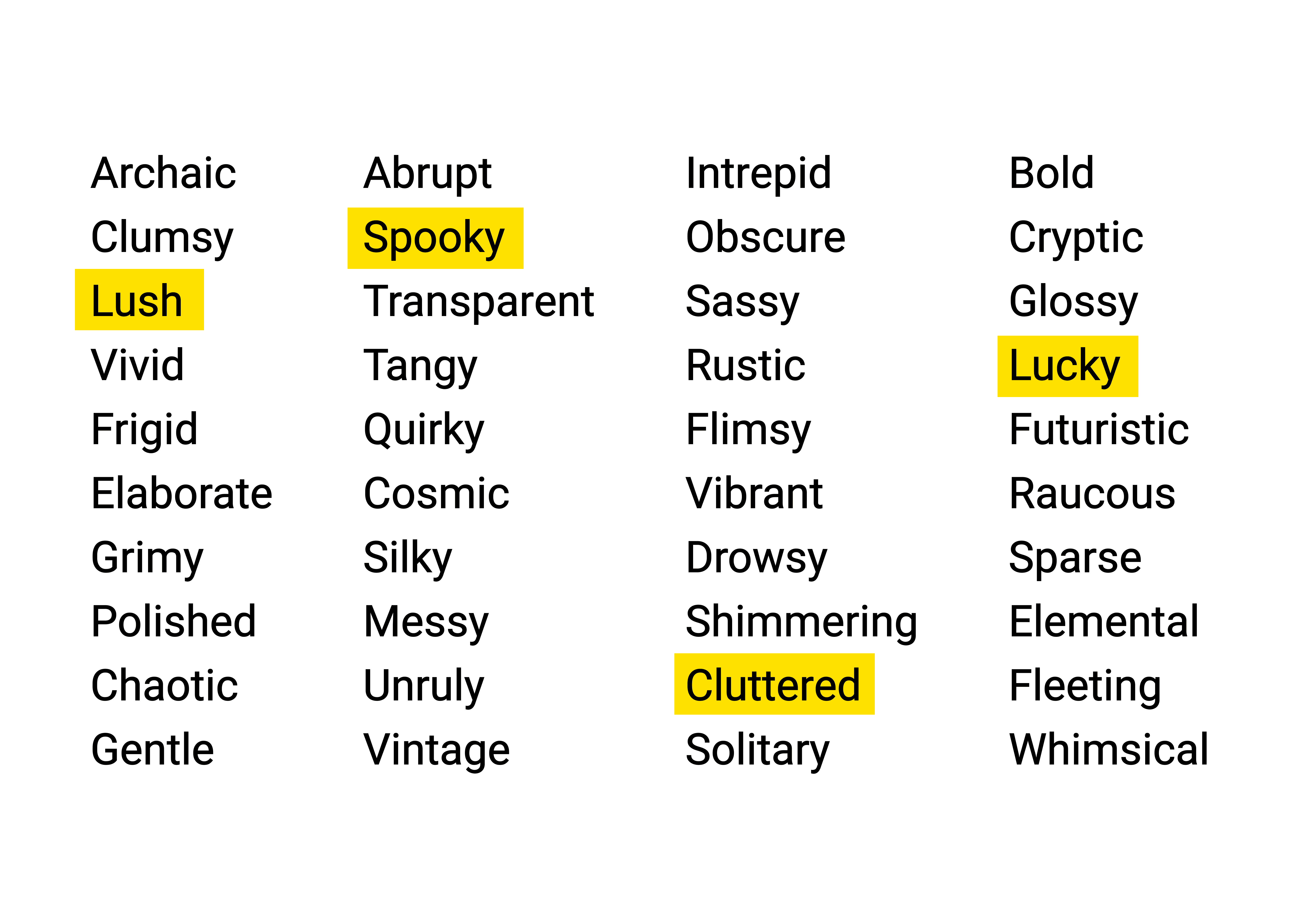
Before settling on a theme for my sign-in page, I began by brainstorming over 40 adjectives. I wanted to avoid narrowing my options to just the first few that came to mind, so I set aside 30 minutes to freely jot down adjectives as they occurred to me. Once I had my initial list, I selected four to develop further. These four words were Lush, Lucky, Cluttered, & Spooky.
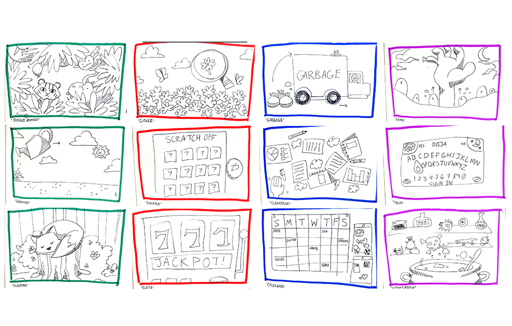
4x3 Sketches
Once I chose four words to advance with, I started brainstorming three concepts for each word, allowing myself a range of options to choose from. I used markers and a physical sketchbook, which enabled me to think quickly and doodle ideas as they flowed, preventing me from getting bogged down in details. This hands-on approach not only kept the process dynamic but also sparked inspiration for additional concepts I hadn’t initially considered. Overall, it encouraged a free-flowing exploration of ideas!
Creating the Assets
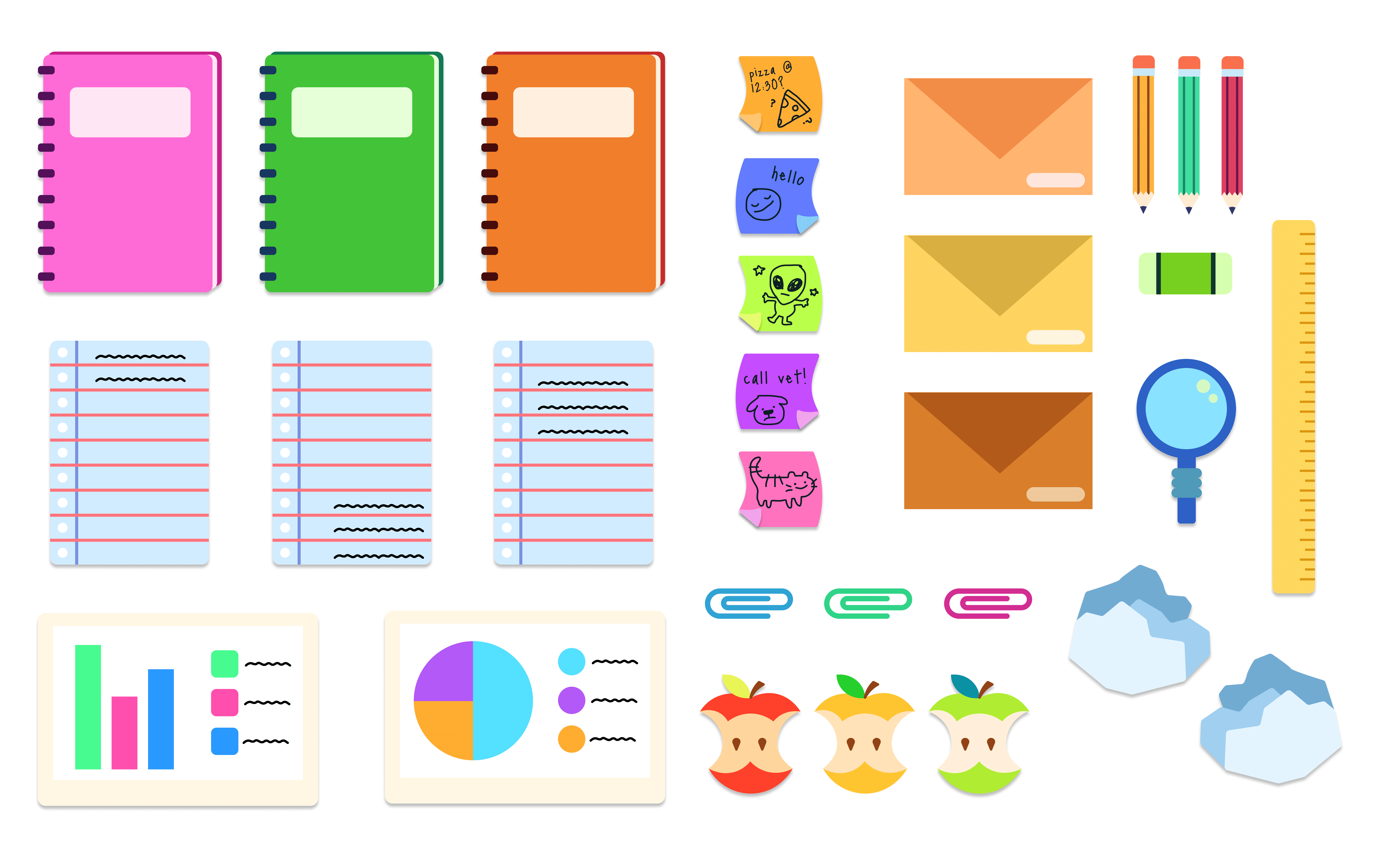
After getting feedback from several peers, I was excited to dive into the "Clean Desk" concept from the "Cluttered" sketches! I loved the idea that it would not only capture the essence of messy by requiring users to clear off the screen before logging in but also provide a dynamic and fun experience. Using Adobe Illustrator to create the assets, I focused on the look of a typical business or student desk, crafting elements like notebooks, loose sheets of paper, and, of course, sticky notes. Once I had everything ready, I couldn’t wait to import them into Figma and prototype the user interactions!
Creating the Interactions
After importing the assets into Figma, I started to fill the screen with as many items as I could. Understanding Figma's limitations, I decided to simulate how these objects would react during user interaction. My goal was for the items to fly off the screen when the user approached them, mimicking the action of swiping things off a desk! However, in Figma, I created "clumps" of items that would scatter when clicked. This involved moving the items away from the canvas in the next frame and using smart animation to fill in the gaps.
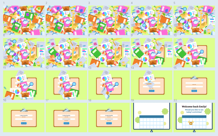
The Completed Project
After animating several frames, I finally completed the desired interaction! I added a sign-in form beneath all the clutter, which users can access after successfully clearing the screen. I finished the interaction by incorporating a drop-down calendar, suggesting that this cluttered sign-in page is the first step toward a stress-free routine managed through the app. By clearing the cluttered screen, users initiate the process of decluttering their daily activities!